Problem
Getting the motivation to work out, or continue your workout routine is difficult. People attempt to help motivate themselves by wearing fitness trackers, but while the data is there, the motivation still is not. The Endeavour Partners found that “40% of U.S. consumers have stopped using their wearable device within six months of receiving it” (2013).
In the spring of 2015, myself and Christopher Henley researched, designed, and prototyped a physical kinetic visualization tool that was inspired by the "flow" or "in-the-zone" feeling that people get while running and doing other athletic activities. Using color and motion, the Flow+Fitness visualizer abstracts and represents data collected from wearables while running or working out.
Lowering the Barrier of Entry to Exercise
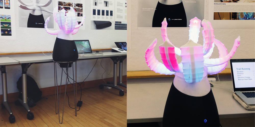
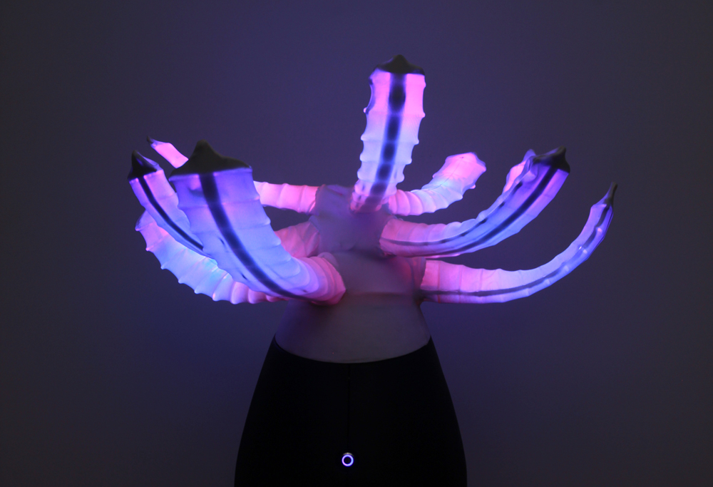
In an effort to lessen the barrier of entry into running and fitness, while creating a new medium to engage with physical activity through spirituality, we designed a new data visualization system for wearable fitness tracking. The Flow and Fitness system, instead of using charts to display data, uses color, form, texture, and light to abstractly display information. The resulting visualization is more of a “feeling” than the representation of hard workout data.
Motivation Through Kinetic Sculpture
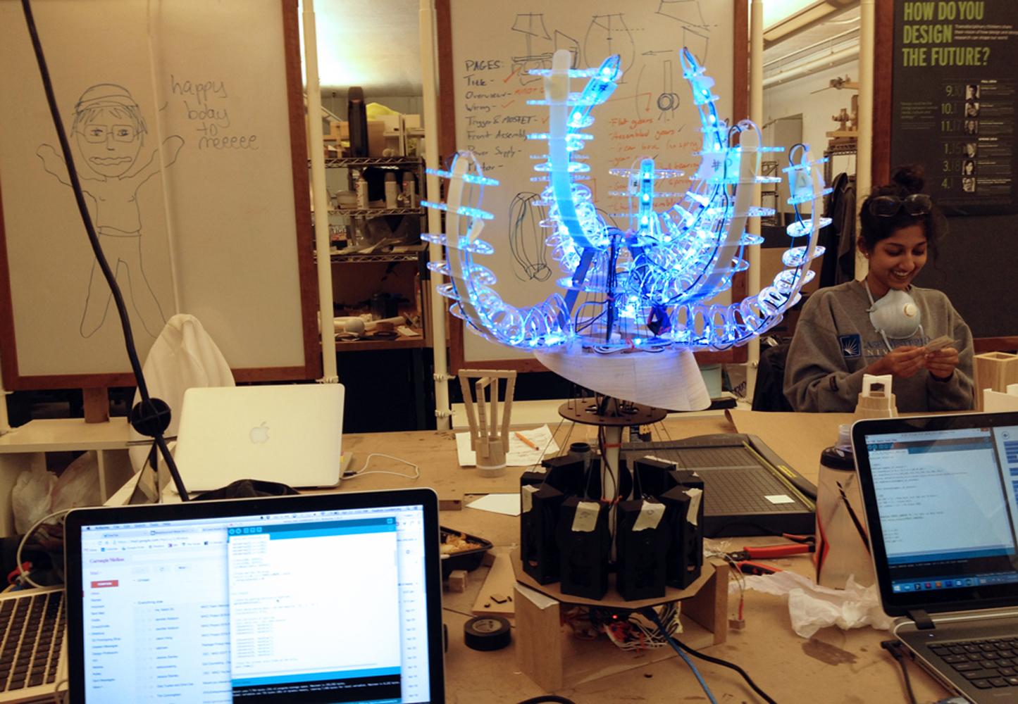
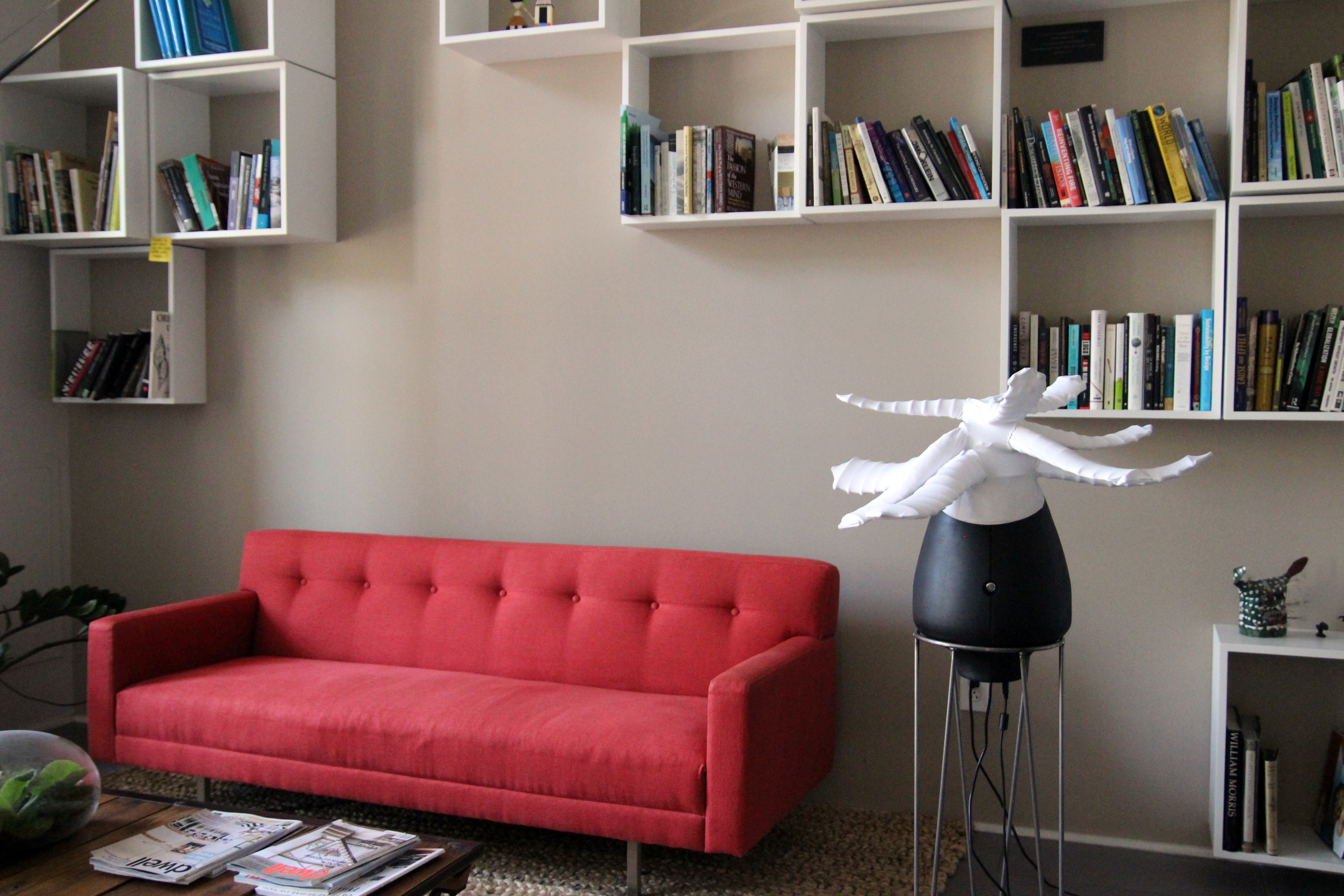
The visualization motivates people by producing unique and ever changing sculptural forms based on the data from their last run. However if a person doesn’t run for several weeks, then the system begins to lower its arms and fade in color, alluding to a wilting plant that needs to be watered.
Data Mapping Methodology
The system analyzes heart rate, speed, elevation change, location, intensity, and other environment factors to move and shape the form.
Arm up and down motion: Environmental texture
Arm color: Workout engagement
Ebb and flow kinetic movement: Recency of workout

Selected Process
Data Gathering and Manipulation
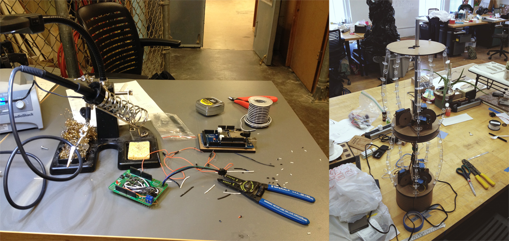
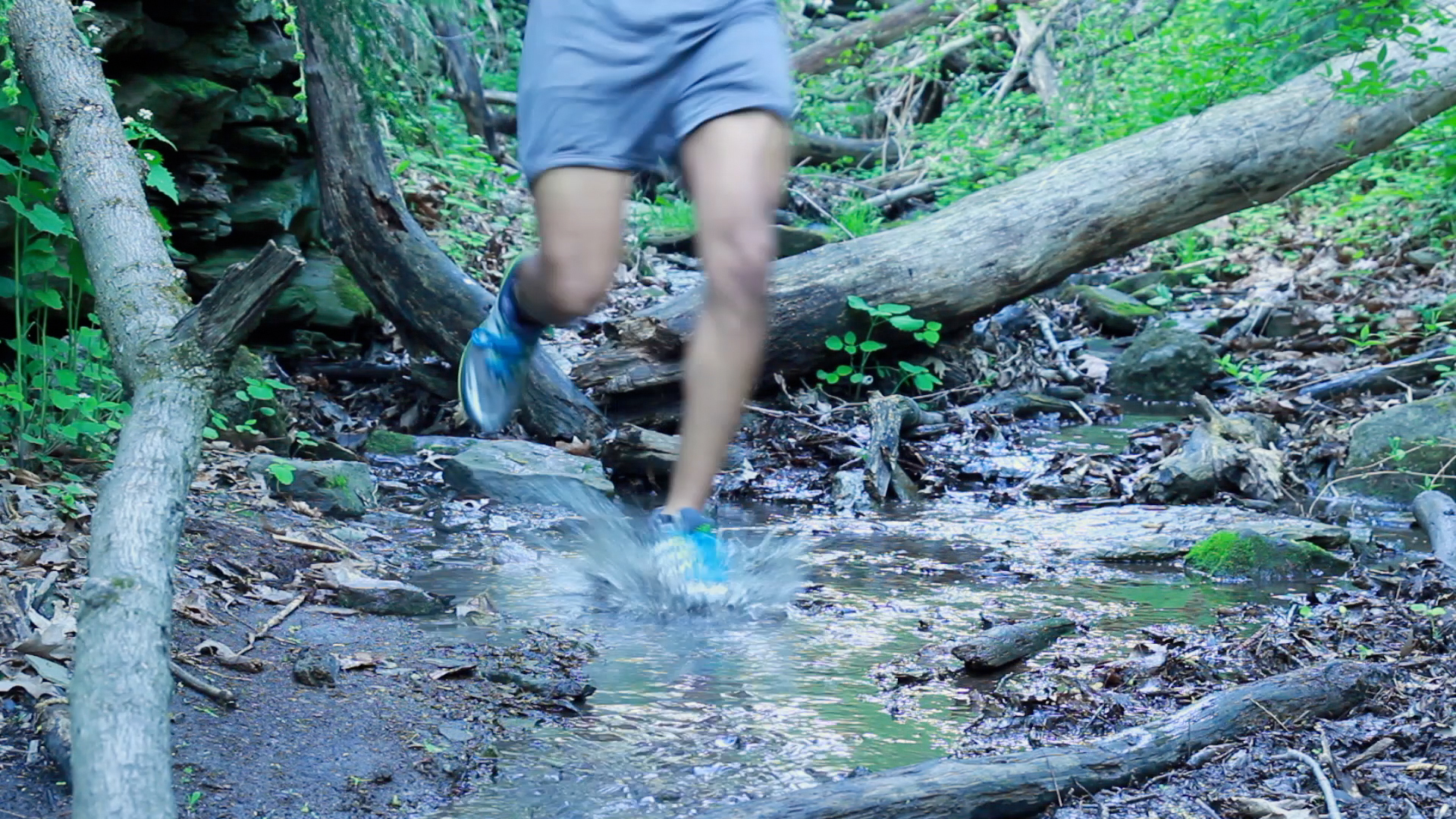
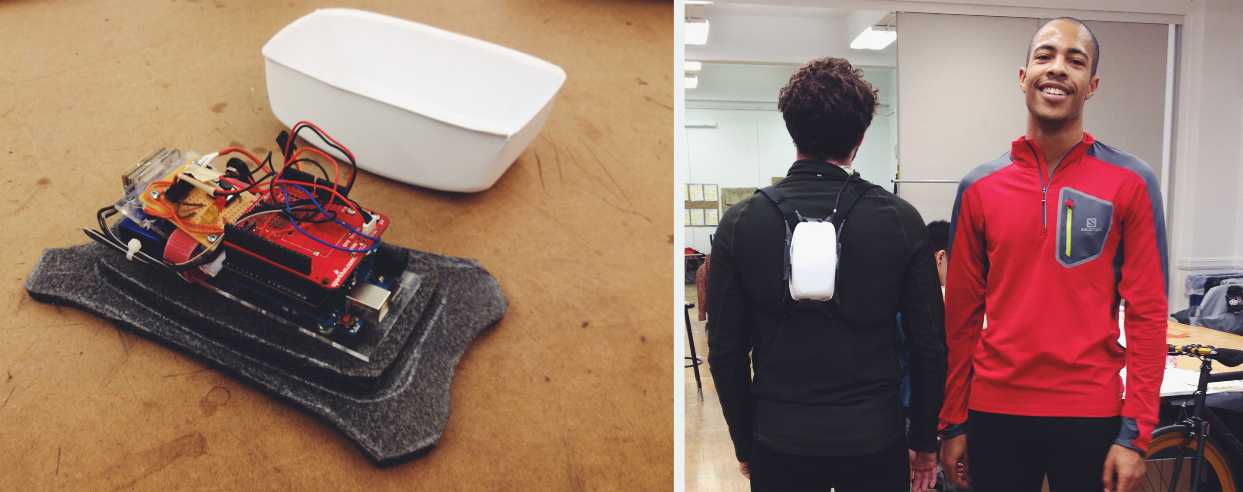
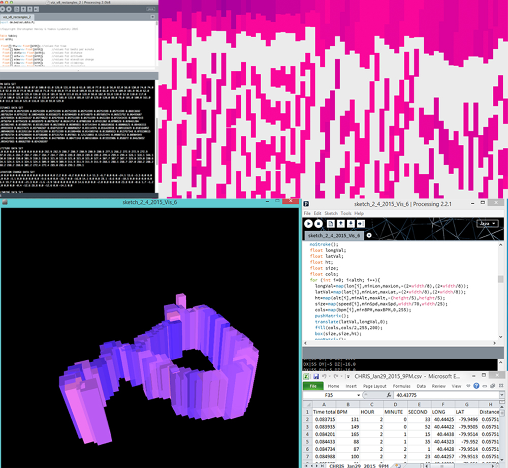
To effectively capture raw workout data, we built and coded a small Arduino-powered data gathering backpack. It captures the wearer’s heart rate, GPS location, and other environmental attributes and then saves them to an onboard SD card. The data is stored in a file format used by Excel. This allows us to have the data properly formatted without any additional user manipulation after they plug the SD card into their computer. With all this raw data we began to write Processing scripts to explore and evaluate different ways of mapping and visualizing the workouts. The data was mapped to color, tone, size, shape, and form.
Defining a Visual Language
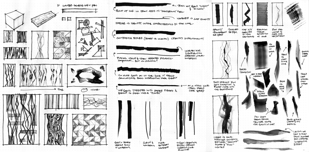
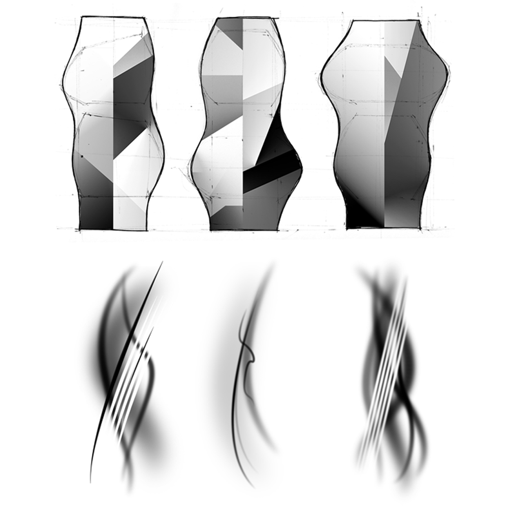
To create a successful visual language that is abstract yet still evokes the different feelings that we are aiming for, we produced thumbnail sketches to explore how line qualities, features, and compositions related to people’s interpretation of the mood and feeling. Additionally we began exploring ways to showcase different fidelities of information: from very high level ‘feeling’ and ‘mood’ to more detailed heart rate and pacing. We embodied what we learned from the data and graphical studies and began iterating on what type of physical form could best represent this complex data set in a way that was appealing and motivational.
Building and Scripting
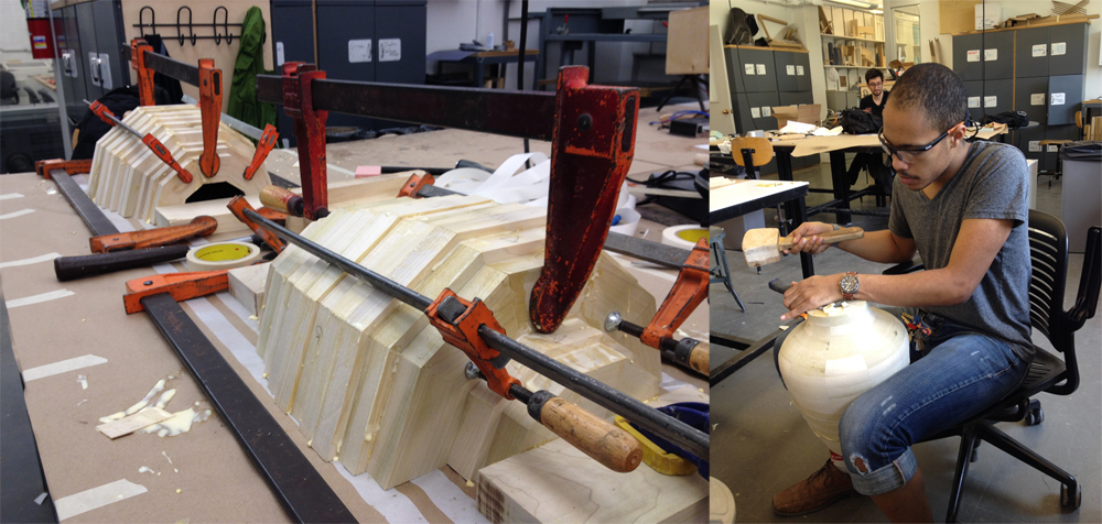
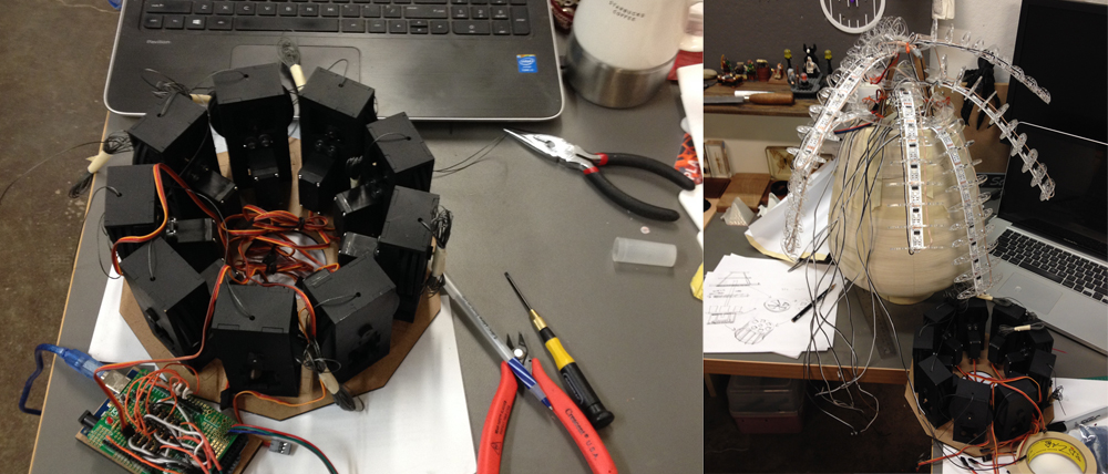
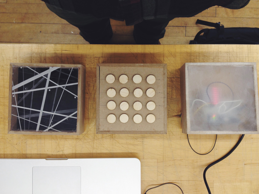
To bring our concept to life we prototyped a movement mechanism that uses nine servos to tighten or loosen strings and articulate the arms in different directions and with varying levels of intensity. Each arm is embedded with an individually addressable rgb LED strip and a flex sensor to read the arm’s current position. The entire mechanism was enclosed inside of a hollow vessel and covered with a stretchy spandex to help make our abstract concept more tangible and perceptible. Also it allowed us to evaluate the effectiveness of the prototype as an athletic motivational tool, as we had initially set out to do.
